
Why Bedroom Color Choices Matter in 2025
Color impacts mood. This is especially true in bedrooms. In 2025, color psychology is a big deal in home design. People want spaces that feel calm and inviting. The colors you choose can make or break that goal. For example, soft blues promote relaxation. Bright yellows boost energy. Understanding this helps homeowners create better spaces.
Think about your own bedroom. Does it feel peaceful? Or does it stress you out? Color plays a role. Trends in 2025 focus on balance. Warm tones mix with cool shades. Earthy hues blend with bold accents. These combinations aim to meet emotional needs.
Global Influences Shaping Bedroom Colors
Global trends shape local choices. Travel, art, and culture inspire colors. In 2025, global connections are stronger than ever. This affects bedroom palettes. For instance, Scandinavian designs favor light neutrals. Japanese aesthetics bring in warm woods. These styles mix into everyday homes.
- Scandinavian: Whites, grays, and pale woods.
- Japanese: Earthy browns, greens, and muted tones.
- Mediterranean: Blues, whites, and terracotta.
These influences make rooms feel unique. They also connect us to the world. A homeowner might pick a Mediterranean blue wall after a trip to Greece. Small touches like these matter.
Sustainability and Its Role in Color Trends
Sustainability drives choices in 2025. Eco-friendly paints are in demand. People care about what they put on their walls. Harmful chemicals are out. Natural pigments are in. This shift changes bedroom colors too.
Earthy tones dominate sustainable design. Think olive green, sandy beige, and clay red. These colors mimic nature. They also pair well with recycled materials. For example, a reclaimed wood headboard looks great against a moss-green wall.
I once helped a friend redo her bedroom. She chose eco-friendly paint in a soft sage. The room felt fresh yet grounding. It proved how small changes make a big difference.
How Technology Impacts Bedroom Colors
Technology shapes trends too. Smart lighting is a game changer. With adjustable lights, colors shift throughout the day. Morning hues might be bright. Evening tones turn warm and dim. This tech lets people customize moods.
Virtual tools also help. Apps let you test colors before painting. Imagine seeing a lavender wall in your space before committing. These tools reduce guesswork. They save time and money.
In 2025, tech meets design seamlessly. Smart mirrors with mood lighting are trending. These gadgets blend function with style. They’re practical but also fun to use.
Cultural Shifts Driving Bedroom Color Trends
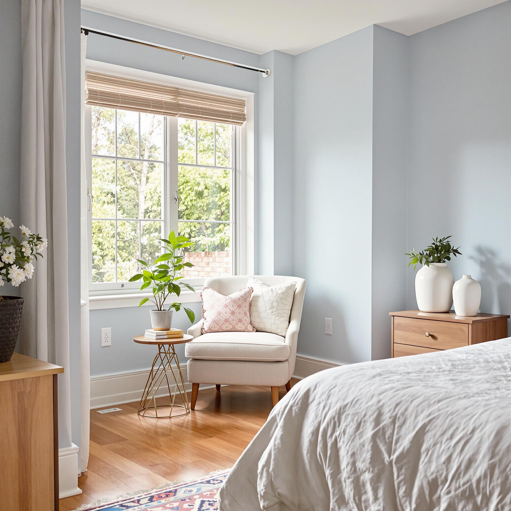
Cultural shifts influence bedroom colors. In 2025, self-care is a priority. Bedrooms become personal sanctuaries. Calming colors reflect this need. Soft pastels and muted tones are popular.
Remote work also plays a role. More people work from home. Bedrooms double as offices. Neutral colors create focus. Accent walls add personality without overwhelming.
One client told me her gray bedroom boosted productivity. Yet, a mustard-yellow chair kept the space lively. Balance is key. Function meets comfort in modern design.
Pantone’s Influence on Bedroom Colors
Pantone sets trends every year. Their Color of the Year impacts bedrooms. In 2025, expect rich, layered tones. Deep jewel colors like emerald and sapphire will shine. These shades add luxury.
But Pantone isn’t just about bold colors. They highlight neutrals too. Warm taupes and creamy whites remain staples. These act as backdrops for bolder accents.
Last year, I painted my guest room in Pantone’s shade of teal. Guests loved it. The color felt serene yet stylish. Following trends doesn’t mean losing individuality.
Lifestyle Needs and Emerging Bedroom Trends
Lifestyles shape design. In 2025, wellness drives choices. People want calming retreats. Cool blues and greens dominate. These colors lower stress levels.
Families look for versatile spaces. Kids’ rooms feature playful pops of color. Teens prefer bold statements. Adults lean toward timeless elegance. Every age group has different needs.
My nephew’s room mixes navy walls with orange accents. It’s fun but not childish. As he grows, the design adapts. Flexibility matters in modern homes.
Key Takeaways for Choosing Bedroom Colors
Choosing colors isn’t just about looks. It’s about emotions. Think about how you want to feel. Calm? Energized? Inspired? Let that guide your choices.
- Consider global influences for unique ideas.
- Pick eco-friendly options for a healthier home.
- Use technology to enhance your space.
- Follow cultural shifts for relevance.
- Trust trusted sources like Pantone for guidance.
Bedroom colors in 2025 reflect who we are. They blend psychology, trends, and personal style. Make your space meaningful. After all, it’s where life happens.
Earthy Neutrals: The Calming Backbone of 2025 Bedroom Trends
Let’s chat about earthy neutrals for a moment. You know those cozy shades like taupe, sand, and mushroom? They’re warm, grounding, and make you want to relax. These colors are going to dominate bedroom designs in 2025. Honestly, it’s no shock—they’ve been sneaking into our homes for years, from boho rugs to sleek furniture. But here’s the new twist: richer textures and layered tones are giving them a fresh edge.
Funny story—I recently redid my guest room with this palette. I went for soft beige walls and paired them with oatmeal-colored linen curtains. Then I added a chunky knit throw and terracotta planters. It felt cozy but not overwhelming, exactly what you need for a restful space.
Why do these colors work so well? For one, they calm you down. Studies show neutrals lower stress because they remind us of nature—sandy beaches or sunlit deserts. Plus, they go with almost any style. Whether you’re into modern farmhouse or eclectic global vibes, earthy neutrals let other elements shine.
Worried about blandness? Don’t be. Mix textures like rattan, wool, or raw wood to add depth. And don’t forget accents! A bold piece of art or a standout lamp keeps things interesting.
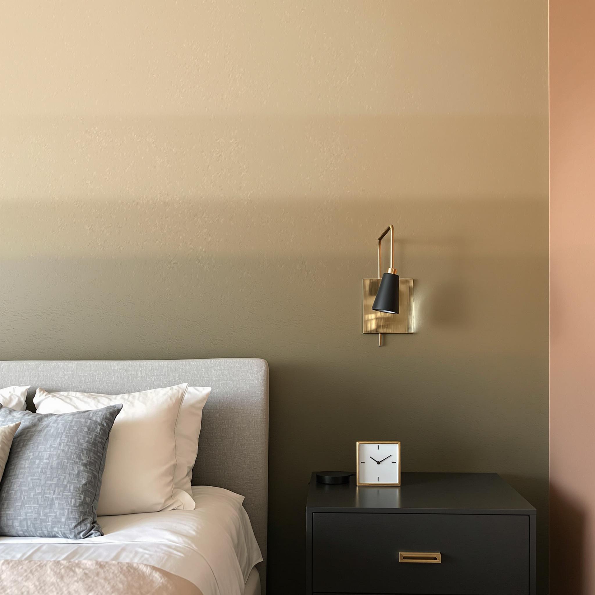
Bold Jewel Tones: Making a Statement Without Overdoing It
Now, let’s switch gears to something bolder: jewel tones. Think emerald green, sapphire blue, and amethyst purple. These colors scream luxury but still feel inviting. They’re all over the 2025 trends, and they’re not just for maximalists anymore.
Jewel tones can turn a room into a sophisticated retreat. I once helped a friend redo her master bedroom. She was hesitant about painting one wall deep teal. Guess what? That single accent wall transformed the whole vibe. Paired with gold-framed mirrors and velvet pillows, her room looked magazine-worthy. She said it made her feel like royalty every time she walked in. Pretty cool, right?
What makes these colors special is their mood-boosting power. Emerald green feels lush and refreshing, while ruby red feels bold and passionate. Perfect for adding drama in larger bedrooms. Smaller spaces? Use them in accents like bedding, artwork, or a painted headboard.
One tip: balance is crucial. If you go big with a jewel-toned feature wall, keep the rest simple. If you use them in accessories, mix with neutrals to avoid overload. Oh, and metallic finishes? They pair beautifully with jewel tones. More on that soon!
Soft Pastels: Sweet Dreams in Subtle Hues
Alright, let’s lighten things up—literally—with soft pastels. Lavender, blush pink, mint green, and baby blue are trending for 2025. Honestly, I’m loving it. These gentle shades have a soothing quality. They remind me of my childhood bedroom with pale lilac walls and a white canopy bed. Maybe that’s why I slept so soundly back then!
Pastels often get dismissed as too girly or juvenile, but they’ve grown up. Designers are using them in fresh ways now, like pairing blush pink with charcoal gray or mint green with navy blue. Suddenly, these colors feel modern and stylish instead of cutesy.
The best part? Soft pastels are super versatile. In small rooms, they make the space feel bigger and airier. In larger rooms, they add whimsy without being overwhelming. They soften harsh lines and create a dreamy vibe. Waking up surrounded by a cloud-like palette? Instant serenity.
Not ready to commit fully? Start small. Swap out throw pillows or try a pastel-colored rug. Funny story—I once bought a mint green bedside table at a thrift store on a whim. It ended up tying my whole bedroom together. Sometimes, less really is more.
Futuristic Metallics: Shining Bright in Modern Bedrooms
Now, let’s get futuristic. Metallic shades like copper, brass, silver, and rose gold are moving beyond kitchens and into bedrooms. Honestly, I didn’t see this trend coming—but now I’m obsessed. These shimmering hues add a sleek, high-tech touch to bedroom design while blending seamlessly with warm or cool palettes.
At first, I was skeptical. Metal seemed cold to me. But then I stayed at a boutique hotel last year. The headboard had fabric with subtle metallic threading. It caught the light just enough to give the room a glamorous yet understated glow. That’s when I realized metallics don’t have to shout—they can whisper elegance.
Here’s the deal: metallics work best as accents. Picture a copper-framed mirror leaning against a wall or a brass pendant light casting warm reflections. Even small touches like drawer pulls or picture frames can elevate your space. They pair beautifully with jewel tones, adding opulence without going overboard.
For minimalists, silver and chrome are perfect. They reflect light and make small rooms feel brighter. Rose gold leans warmer and works well with pastels or neutrals. There’s a metallic shade for everyone—it’s about finding what suits your style.
Mixing and Matching: Finding Your Perfect Palette
You might be wondering, “Can I mix these palettes?” Absolutely! Combining color families is one of the biggest trends for 2025. Here’s how to do it:
- Start with a base: Pick one main color family, like neutrals or pastels, to anchor the room.
- Add contrast: Bring in a secondary palette through textiles, furniture, or decor. For example, pair neutral beige with jewel-toned pillows.
- Finish with metallics: Use metallic accents sparingly to tie it all together. A brass lamp or silver frame does the trick.
A word of caution: don’t overdo it. Too many competing elements can feel chaotic. Stick to two or three main colors and let the rest support them.
Here’s a fun idea: think about the mood you want. Want calm? Go heavy on neutrals and pastels. Need energy? Try jewel tones and metallics. Your bedroom should reflect *you*.
Final Thoughts Before You Get Started
Before jumping into repainting or redecorating, consider your bedroom’s size, lighting, and furniture. Natural light changes how colors look, and artificial light can shift them even more. Test swatches before committing. Remember: trends fade, but comfort and functionality last.
And hey, don’t stress too much about perfection. Decorating should be fun—a chance to express yourself and create a space that feels like home. So grab that paintbrush, rearrange those pillows, and watch your bedroom transform into a 2025-worthy haven.
Paint Techniques to Make Your Bedroom Pop
Let me tell you something about paint. It’s the unsung hero of interior design. You can go bold, subtle, or try something new. It’ll completely change your space. For 2025, don’t just slap on a coat of paint. Some of my favorite techniques mimic textures or add depth without much effort.
Ever tried an ombre wall? It’s not just for nurseries anymore. Start with a darker shade at the bottom—like that deep olive green everyone loves—and fade it into a lighter tone as you move up. This works great with neutrals like warm beige or soft gray. If you’re unsure, test it on one accent wall first. That way, you’re not fully committed.
Another idea? Textured finishes. Think limewash or plaster effects. They give walls a tactile, almost handmade feel. Pair them with earthy tones like terracotta or muted browns. Here’s a tip: add metallic accents with stenciling or gold leaf touches. It adds glam without being too much.
Furniture Choices That Complement Trending Colors
Alright, let’s talk furniture. This is where most people get stuck. The good news? You don’t need to replace everything. Sometimes swapping out a few pieces or tweaking what you have is enough. There are plenty of ways to incorporate 2025 hues without spending a fortune.
Start with statement pieces. A velvet armchair in emerald or sapphire can elevate your bedroom. Or try a wooden bedframe in a natural finish. Light oak or walnut looks great against neutral backdrops. My mom once said, “Good furniture should feel like a hug.” Cheesy? Maybe. True? Absolutely.
Funny story: Last year, I redid my guest room. I found a mid-century dresser at a thrift store. The wood stain was ugly, but after sanding and painting it matte black, it became the star of the room. Don’t underestimate DIY when working with trendy colors. If you’re adventurous, reupholster a bench or ottoman in a fabric that matches your palette. Linen, bouclé, or textured wool works wonders.
Accent Pieces & Textiles: The Little Things Matter
Here’s the thing about accent pieces—they’re the cherry on top. Sure, you could skip them, but why would you? These small details tie everything together and make your space feel intentional. Plus, they’re easy to swap out when trends change.
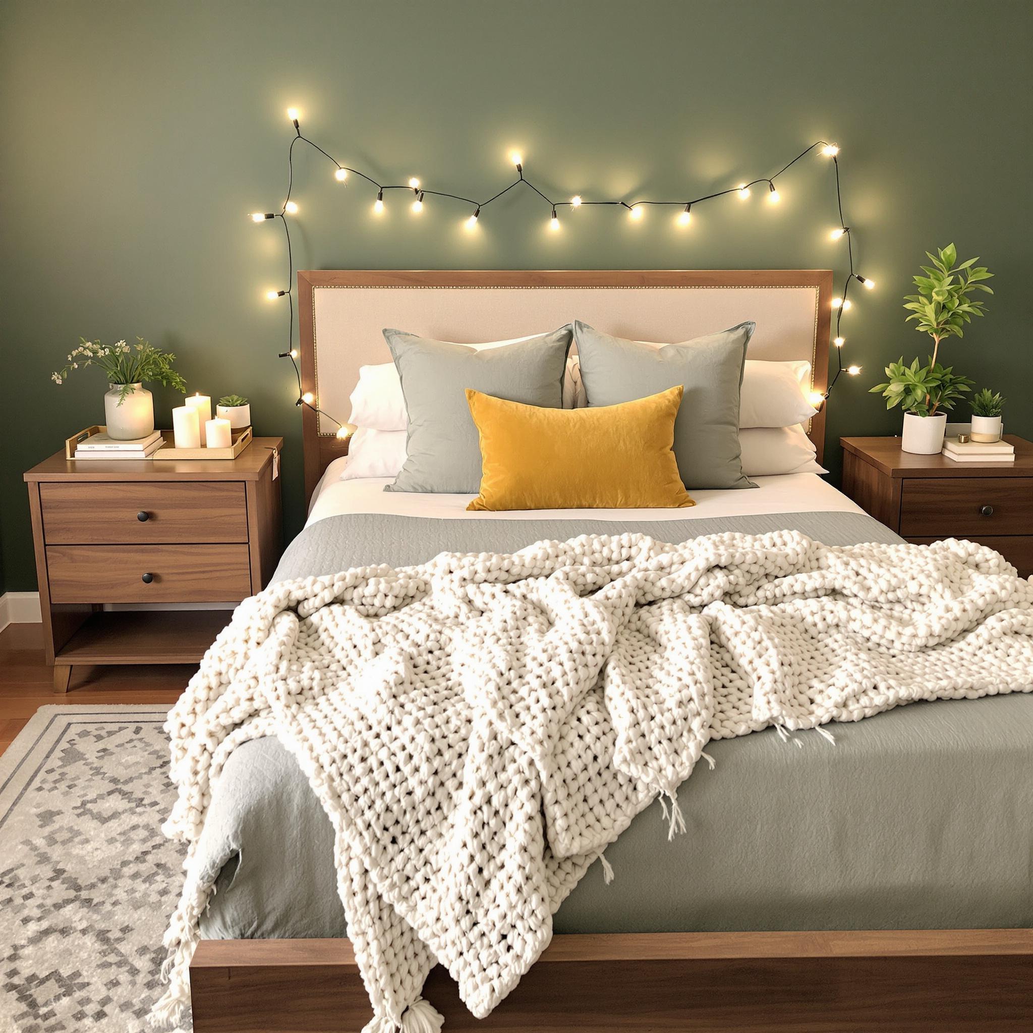
Throw pillows are a great place to start. Mix patterns, textures, and colors to keep things interesting. Try velvet, knit, and embroidered fabrics in shades like sage, mustard yellow, or dusty lavender. Layer different sizes and shapes to make the bed inviting. And don’t forget throws! Drape a chunky knit blanket over the foot of the bed for extra coziness.
Rugs are another game-changer. A plush area rug in a muted tone anchors the room and adds warmth underfoot. I love rugs with subtle geometric patterns or fringe edges. They add personality without overwhelming the space. Oh, and decorative trays on nightstands or dressers aren’t just functional—they’re stylish too. Fill one with candles, books, or small plants for an instant upgrade.
Lighting Strategies to Highlight Your Color Palette
Confession time—I used to think lighting was boring. But it’s basically magic. The right lighting can make or break your color scheme. Warm light bulbs (around 2700K) enhance earthy tones and create coziness, while cooler lights highlight crisp whites and blues. See? Magic.
Lamps are lifesavers for creating ambiance. Table lamps with colored glass bases or ceramic finishes add pops of color discreetly. Floor lamps with adjustable arms are even better. They let you direct light where you need it. Pro tip: Use dimmer switches whenever possible. Harsh overhead lighting kills the vibe.
Candles and string lights are worth mentioning too. Flickering candlelight makes any room feel dreamy. String lights draped around a headboard or window frame? Total mood booster. Bonus points for LED options—they last longer and save energy.
Maintaining Timelessness While Staying On-Trend
Let’s wrap this up with some wisdom. Trends come and go, but good design sticks around. So how do you balance fresh and timeless? Focus on quality over quantity. Go for classic silhouettes paired with modern accents. A sleek white duvet cover never goes out of style, but bold throw pillows keep it current.
Less is often more. You don’t need every 2025 trend in your bedroom. Pick two or three elements you love and build from there. Trust me, your future self will thank you. I learned this the hard way after going overboard with neon accents in college. Live and learn, right?
Final Thoughts
At the end of the day, designing your bedroom is about making it yours. Whether you embrace the latest trends or stick to classics, the goal is comfort and inspiration. With these tips—from paint techniques to lighting strategies—you’ve got all the tools you need. Happy decorating!
FAQs About Incorporating 2025 Bedroom Colors
- What are the top 2025 bedroom colors?
Earthy greens, warm neutrals, deep blues, and rich jewel tones. These shades bring calmness and sophistication. - How do I choose the best color for my bedroom?
Consider your preferences and the mood you want. Soft tones promote relaxation; bolder hues add energy. - Can I mix multiple trending colors in one room?
Absolutely! Stick to a cohesive palette and use varying shades within the same family to avoid clashes. - Is it okay to use wallpaper instead of paint?
Definitely! Wallpaper offers endless possibilities. Opt for removable options if you prefer flexibility. - How can I update my existing furniture to match new colors?
Try painting, reupholstering, or accessorizing with items like cushions or throws in complementary shades. - What kind of lighting works best for showcasing color?
Warm LED lights or dimmable fixtures highlight colors beautifully. Avoid overly bright fluorescents. - Should I invest in expensive textiles?
Not necessarily. Look for durable, well-made pieces that fit your budget. - How do I prevent my room from looking dated?
Stick to timeless furniture designs and incorporate trendy elements sparingly. Neutral base colors help too. - Where can I find affordable accent pieces?
Thrift stores, online marketplaces, and discount home decor retailers often carry unique finds at reasonable prices. - How do I know when I’ve gone overboard with trends?
If your room feels chaotic or overwhelming, scale back. Aim for a balanced mix of old favorites and new additions.