
Why Light Color Palettes Matter in Small Spaces
Light colors make small spaces feel bigger. They reflect more light, brightening every corner. This simple trick transforms cramped areas into airy retreats.
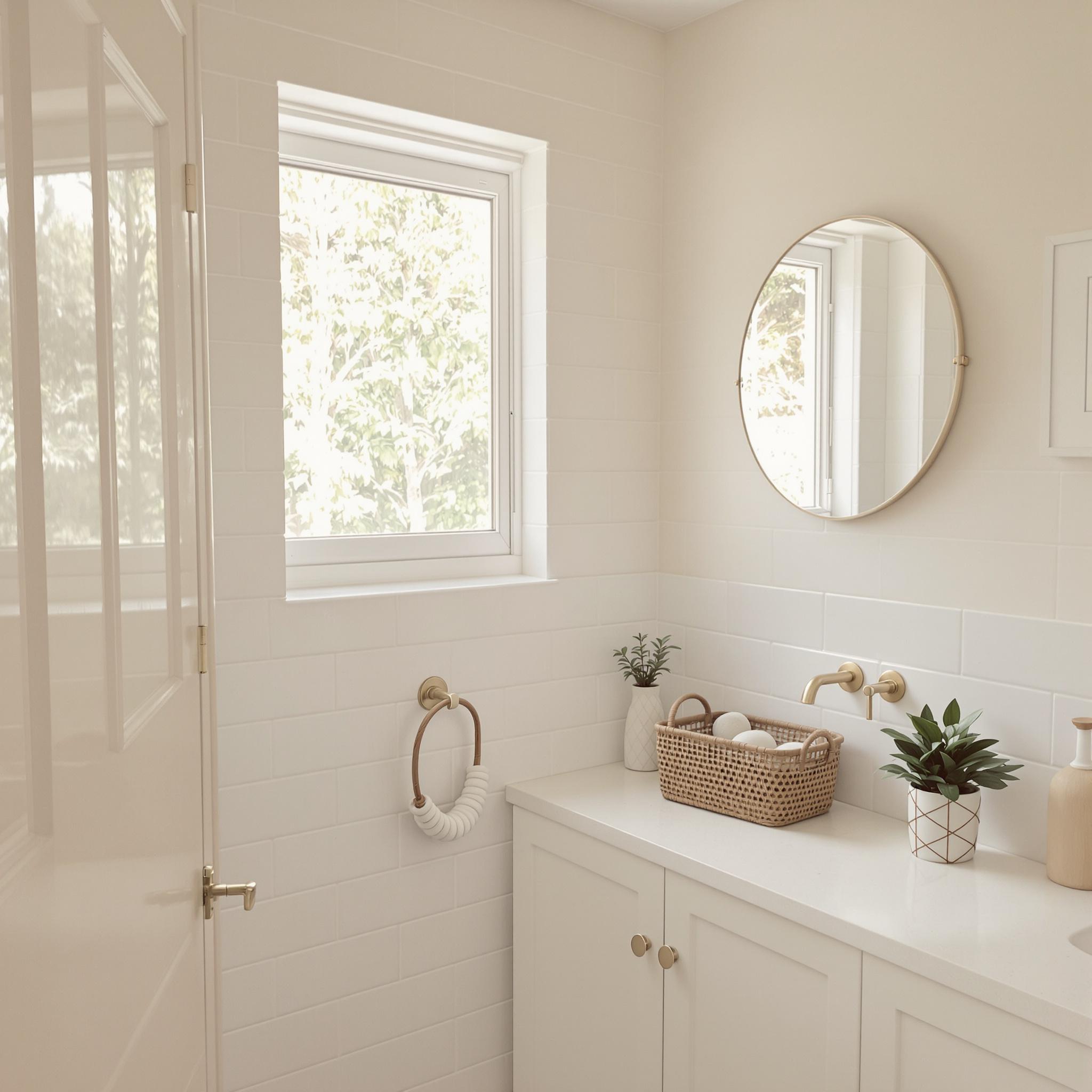
Think about a tiny bathroom. A white or soft beige palette can open it up. I once painted my small kitchen light gray. It felt like the walls moved back a foot. The change was immediate and striking.
Color affects how we see space. Dark shades absorb light, making rooms feel smaller. Light hues do the opposite. They create an illusion of depth and openness.
How Colors Influence Mood and Perception
Colors aren’t just about looks. They shape how we feel in a room. Light shades bring calm and clarity. They reduce stress in tight quarters.
Pale blues and greens evoke peace. Soft yellows add warmth. Neutral tones like ivory or taupe feel grounding. These choices impact daily life more than you might think.
Imagine a small home office. A light blue wall boosts focus. It also makes the space feel less confined. Your mind feels freer to work.
Practical Benefits of Using Light Colors
Light colors offer practical perks too. They hide dirt better than dark shades. A cream-colored sofa shows fewer smudges than a black one.
They also save money on lighting. Reflective surfaces cut down on the need for lamps. Natural light does most of the work.
Cleaning becomes easier as well. Dust and marks stand out less. This saves time and effort in maintaining your space.
Common Misconceptions About Light Colors
Some people avoid light palettes. They fear they’ll look bland or sterile. This isn’t true if you layer textures and accents.
- Add wooden furniture for warmth.
- Use patterned rugs for interest.
- Incorporate plants for life and color.
Another myth? Light colors are only for modern homes. They work in traditional spaces too. Picture a cottage with pale lavender walls. It’s cozy, not cold.
Others think light shades are hard to maintain. With proper care, they stay fresh for years. Sealants and washable paints help.
Psychological Impact of Light Colors
Light colors affect emotions. They lift spirits and clear minds. This matters in small spaces where clutter can overwhelm.
I once visited a friend’s studio apartment. Her pastel pink walls made the room inviting. Despite its size, it felt cheerful and calm.
Studies show light colors reduce anxiety. They create a sense of order. This is key in compact living areas.
Tips for Choosing the Right Light Palette
Start with your room’s purpose. A bedroom needs soothing tones. Think pale lavender or soft gray.
For kitchens, try crisp whites or light yellows. These energize without overwhelming. Living rooms shine with warm creams or beiges.
Test paint samples first. Lighting changes how colors look. Morning sun alters shades compared to evening glow.
Don’t forget trim and ceilings. Painting them white enhances brightness. It keeps the space feeling open.
Balancing Light Colors with Personality
Light palettes don’t mean boring. Add bold accents to express yourself. A navy throw pillow or mustard curtains pop against white walls.
Artwork brings personality too. Hang vibrant pieces to break monotony. Even black-and-white photos add depth.
Furniture plays a role. A rich wood table anchors a light room. Metallic finishes like brass or copper add sparkle.
Making the Most of Natural Light
Light colors amplify sunlight. Pair them with sheer curtains to maximize brightness. Avoid heavy drapes that block rays.
Mirrors boost light even more. Place one opposite a window. It reflects daylight across the room.
Choose glossy finishes for furniture. Shiny surfaces bounce light around. Matte textures absorb it instead.
Avoiding Overuse of Light Colors
Too much light can feel flat. Mix in darker elements for balance. A charcoal accent wall adds drama.
Floors should contrast slightly. Dark wood or tile grounds the space. All-white rooms risk feeling unfinished.
Accessories matter too. Black picture frames or dark lampshades anchor decor. They prevent the room from floating away.
How to Make the Most of Whites, Pastels, and Neutrals in Small Spaces
Let’s chat about white. You’ve probably heard it makes a room feel bigger. True, but not all whites are the same. A super-bright white can feel cold, like a hospital. Off-white or cream feels warmer. I once painted my studio apartment pure white, thinking it’d feel airy. Instead, it felt like living in a cloud—cold and lifeless. Lesson learned.
If you go with white, texture is key. Add woven baskets, linen curtains, or a chunky knit throw. These elements break up the flatness and add depth. They also make the space feel cozy and lived-in.
Pastels: The Secret Weapon for Cozy Vibes
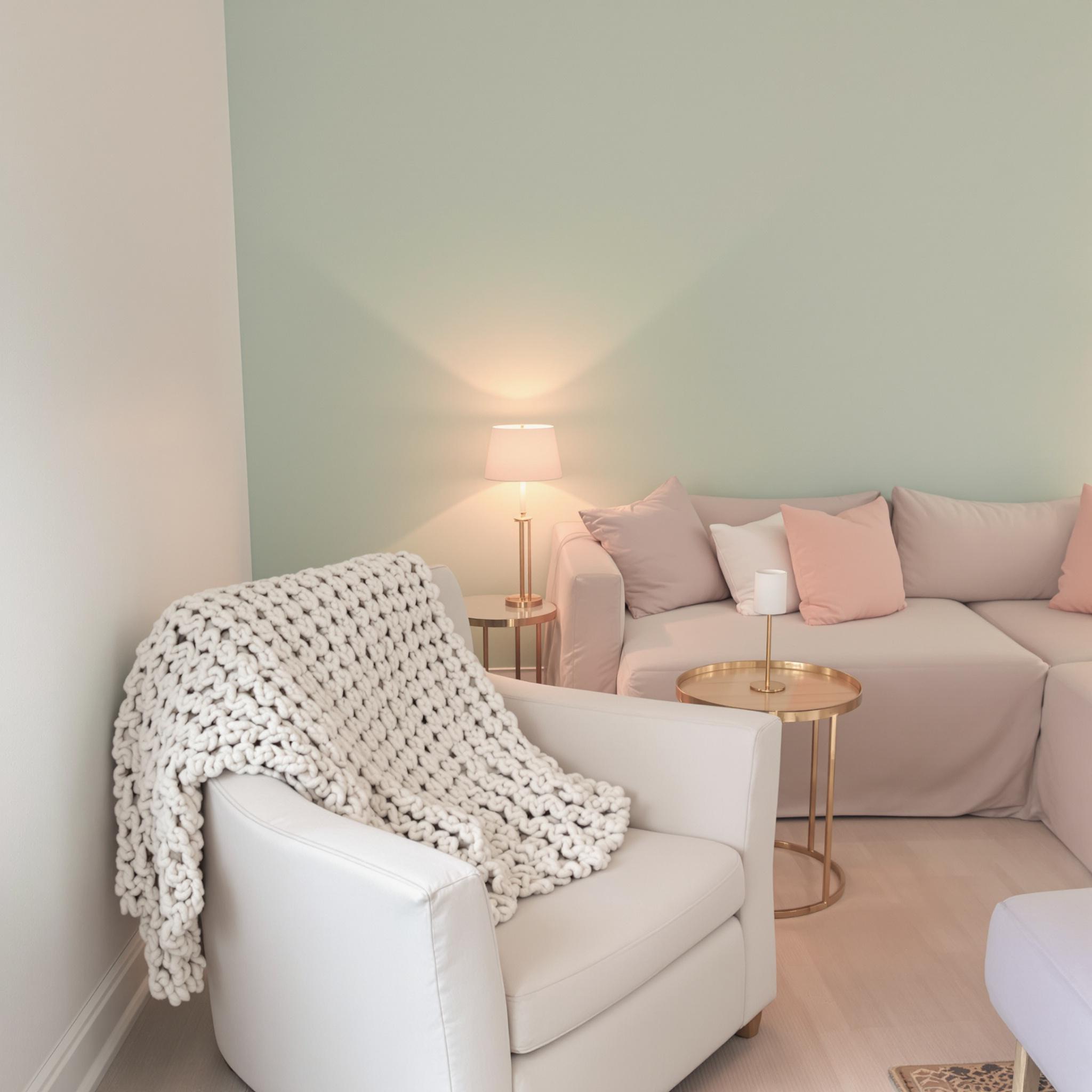
Pastels are perfect for small spaces. Baby blue, mint green, blush pink—they’re soft and inviting. My favorite combo? A pale lavender accent wall with crisp white shelves. It feels fresh and calm, like stepping into a Paris bakery.
Here’s a tip: Stick to one main pastel and use others as accents. Too many pastels can look chaotic, like a kid’s birthday party. For example, pair a mint green couch with blush pillows and gold side tables. Add neutral rugs or curtains to balance the sweetness. Done right, it’s chic and cozy.
Lighting matters too. Natural light makes pastels shine. If your space lacks windows, use warm LED bulbs. Harsh fluorescents can ruin the vibe, making your walls look icy instead of inviting.
Neutrals Done Right: Subtle Sophistication
Neutrals often get called boring, but they’re actually versatile. Beige, taupe, gray—they’re calming and classy. Plus, they mix well with other colors, which is great for small spaces.
I helped a friend redo her tiny city apartment. We used light gray walls and a beige couch. Then we added bold accents like mustard yellow pillows and emerald planters. Her place felt open yet layered, calm yet fun. Funny thing—she started hosting dinner parties every weekend because everyone loved the vibe.
- Tip #1: Use lighter neutrals for walls and big furniture.
- Tip #2: Add darker neutrals sparingly, like on a feature wall or decor.
- Tip #3: Mix in metallics—brass lamps, silver frames—for a touch of glam.
Soft Hues: Where Comfort Meets Style
If pastels are too sweet and neutrals too plain, try soft hues. Dusty rose, sage green, muted terracotta—they’re warm and interesting without being overwhelming. These colors work great in small spaces because they’re soothing but still dynamic.
Take dusty rose. It’s romantic but not overly girly. Pair it with weathered wood and matte black fixtures, and you’ve got a stylish space. My cousin used this combo in her tiny kitchen, and people still compliment it.
Another idea: Use soft hues to define zones in multifunctional spaces. Paint one corner sage green to separate it from the rest. No need for dividers—color does the trick.
The Magic of Pairing Colors with Furniture
Once you pick your colors, think about furniture. In small spaces, bulky pieces can ruin the flow. Go for streamlined designs—mid-century chairs, slim tables, or wall-mounted shelves.
Funny story: I bought a navy velvet armchair, sure it would pop against my pastel pink walls. It didn’t. The size was wrong, and it made the room feel cramped. Lesson? Measure twice, buy once.
When pairing colors and furniture, follow the 60-30-10 rule. Sixty percent of the room should be your main color (walls), thirty percent a secondary color (furniture), and ten percent an accent color (pillows, art). This keeps things balanced.
Textures and Lighting: The Unsung Heroes
Don’t forget textures and lighting. Without them, even the best color palette falls flat. Textures add depth, while lighting sets the mood.
For textures, think beyond fabric. Try rattan chairs, ceramic vases, or patterned wallpaper. Mix materials like wood, metal, and glass for an eclectic look. Just don’t overdo it—a little goes a long way.
Lighting works best in layers. Start with overhead lights, then add floor lamps, table lamps, or string lights. Dimmer switches are great too—you can adjust brightness as needed. Good lighting doesn’t just brighten a space; it transforms it.
Final Thoughts Before You Get Started
Choosing colors for a small space isn’t complicated, but it takes thought. Whether you go with whites, pastels, neutrals, or soft hues, aim for a space that feels open, cozy, and personal.
One last tip: Don’t stress about perfection. Decorating should be fun. Start small, try different combos, and tweak as you go. Your home should reflect you—not Pinterest trends.
Implementation Strategies: Turning Ideas into Reality
Alright, let’s dive in. How do you use a light color palette in a small space without it looking like a hospital or an Instagram fail? I’ve seen some great makeovers—and a few disasters. The difference between success and failure often boils down to planning. You don’t need to be a design expert, just smart about your approach.
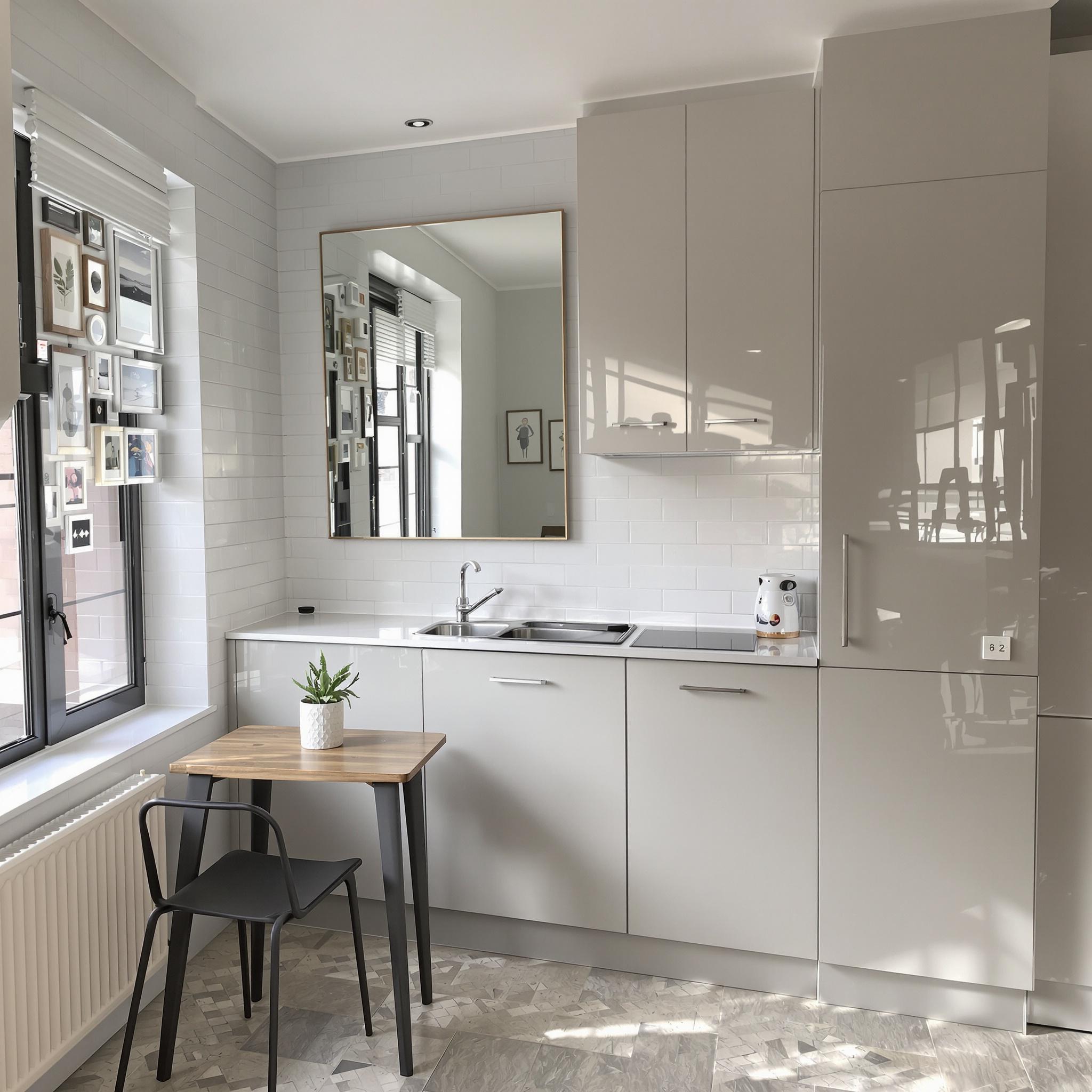
First, check the natural light in your space. People skip this step all the time. If your place gets lots of sunlight, you’re good to go. Light colors will make it feel even brighter. But if your room feels dark, like a cave, lean on reflective surfaces. Glossy tiles or mirrored cabinets can bounce light around and make the space feel bigger. Don’t forget artificial lighting either. Mix overhead lights, sconces, and string lights for a layered look.
Here’s a tip: Always test paint colors before committing. I once painted my kitchen a “neutral” beige that turned out looking like baby puke under fluorescent lights. Yikes. Grab sample pots and test them on different walls at different times of day. It’s a small step that saves major headaches later.
Avoiding Common Pitfalls: Lessons Learned the Hard Way
Let’s talk mistakes. We’ve all made them—I definitely have. One big one is overdoing white. White looks clean and airy, but too much can feel cold, like a dentist’s office. The fix? Add texture. Throw in a chunky knit blanket, a woven rug, or rattan furniture. These break up the monotony and add warmth.
Another mistake? Sacrificing function for style. I once squeezed a tiny round table into my kitchen because it looked cute online. Spoiler: It didn’t work. My elbows kept knocking over mugs, and there wasn’t enough space to prep food. Lesson learned: Focus on how a space works, not just how it looks.
Mirrors are lifesavers in small spaces. Placing one opposite a window doubles the light and creates the illusion of more room. And no, mirrors don’t have to look tacky. Choose ones with interesting frames—a vintage gold one or a sleek modern piece can add personality while serving a purpose.
Incorporating Your Personal Style: Make It Yours
You’ve got the basics down, but how do you make the space truly yours? No one wants their home to feel like a showroom. This is where your personal style comes in. Love bold patterns? Have a thing for mid-century furniture? There’s a way to include it without overwhelming the space.
Accessories are a great way to express yourself. Swap plain throw pillows for ones with fun prints. Hang art that speaks to you. My favorite trick? Gallery walls. They let you show off your personality without taking up floor space. Just keep the frames cohesive—mixing too many styles can look messy.
Don’t forget plants! Greenery adds life to any room. I have a snake plant in my bathroom that survives despite my neglect. It purifies the air and makes the space feel more inviting. Plus, plants go with everything.
Funny story: When I first moved into my studio, I went wild with DIY projects. I painted an accent wall, hung shelves, and tried macramé. Some worked, others… not so much. But those little imperfections made it feel like home. So experiment. You might surprise yourself.
Final Thoughts: Keep It Fun and Functional
Designing a small space with light colors is all about balance. You want it bright and open, but also cozy and uniquely you. Take risks and make mistakes—that’s how you learn what works. Whether you’re redoing a tiny bathroom or a compact kitchen, stay true to your style while keeping function in mind.
So roll up your sleeves and start transforming your space. Who knows? You might just fall in love with your home all over again.
FAQs About Light Color Palettes in Small Spaces
-
Q: How do I choose the right shade of white for my walls?
A: Not all whites are the same. Pick ones with undertones that match your lighting. Warm whites suit low-light areas; cool whites brighten sunny rooms. -
Q: Can I use dark colors in a small space?
A: Yes! Use dark colors on accent walls or furniture. Balance them with lighter elements. -
Q: What’s the best way to add storage without cluttering?
A: Go for multi-functional furniture like ottomans with storage or beds with drawers. Vertical shelving helps too. -
Q: Should I avoid patterns in small spaces?
A: No. Patterns add interest if used sparingly. Stick to small prints on rugs or curtains. -
Q: How can I make my ceiling appear higher?
A: Paint it the same color as your walls or use vertical stripes. Avoid heavy crown molding. -
Q: Is it worth investing in custom solutions?
A: If you can afford it, yes. Custom shelving or cabinetry maximizes space and fits perfectly. -
Q: How do I keep a light-colored room from feeling boring?
A: Add layers of texture and pops of color through accessories like velvet cushions or metallic accents. -
Q: Can I use wallpaper in a small space?
A: Sure! Pick a light, subtle pattern and apply it to one wall to avoid overwhelming the room. -
Q: How important is decluttering?
A: Very. Clutter makes spaces feel smaller. Regularly edit belongings and store essentials out of sight. -
Q: What’s the easiest way to refresh a small space?
A: Swap out old hardware, update light fixtures, or add fresh textiles like curtains and rugs.