
Why Kitchen Color Choices Matter
Color plays a big role in how we feel about our kitchen. It shapes mood and sets the tone for daily life. A bright white kitchen feels clean and fresh. Deep blues or greens bring calm and focus. Warm yellows spark energy and happiness. The right colors can make cooking and gathering more enjoyable.
Think about how you want your kitchen to feel. Do you need a space to unwind? Or a room that boosts creativity? Your color choice will guide this. Trends come and go, but personal needs last. Start by considering what makes you comfortable.
I once painted my kitchen a soft gray. It looked modern but felt cold. Adding warm wood tones made all the difference. Small tweaks can transform a room’s vibe without a full redo.
How Colors Impact Mood and Perception
Colors influence emotions more than we realize. Bright hues like red or orange grab attention. They work well in areas meant for socializing. But too much can overwhelm. Neutral tones like beige or white keep things calm and open.
Dark colors add depth and coziness. Use them on an accent wall or cabinets. Pair with lighter shades to avoid a cramped look. Light colors reflect more light, making small kitchens feel bigger.
Ever walked into a kitchen and felt instantly at ease? Chances are, the colors played a part. Soft greens or blues mimic nature. They create a soothing environment. This is ideal for busy families or anyone who loves to cook.
Trends in Modern Kitchen Color Palettes
Kitchen color trends shift over time. Right now, earthy tones are gaining popularity. Think sage green, terracotta, or sandy beige. These shades connect us to nature. They pair beautifully with natural wood and stone.
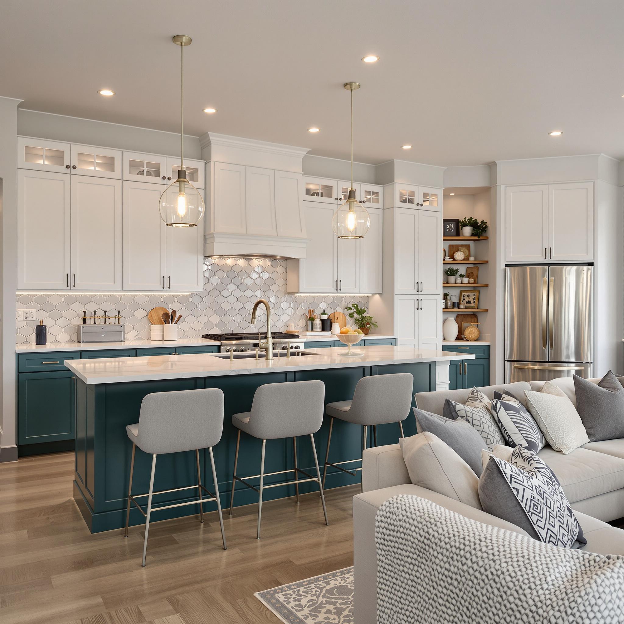
Two-tone cabinets are another hot trend. Combine dark lower cabinets with light uppers. This adds visual interest without clutter. Matte black fixtures also remain popular. They add a sleek, modern touch.
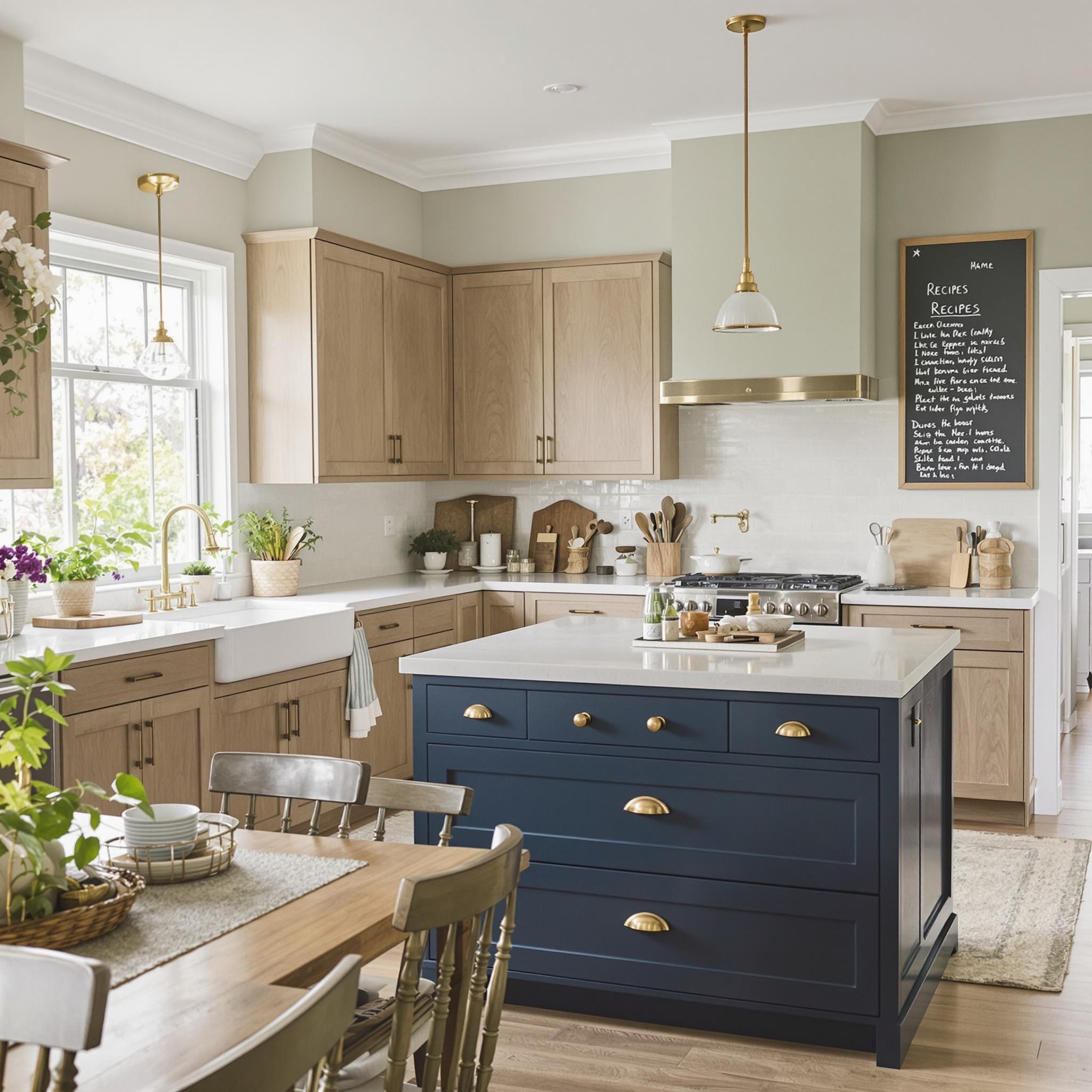
Don’t shy away from bold choices. Navy blue or forest green cabinets feel rich and timeless. Pair them with brass hardware for a polished look. If bold isn’t your style, stick to neutrals. Add personality through accessories like rugs or art.
Creating a Fresh Start with Color
A new color scheme can breathe life into your kitchen. It’s one of the easiest ways to refresh a space. Painting walls or cabinets costs less than a full remodel. Yet it delivers big impact.
Start with a vision. Gather inspiration from magazines or online platforms. Create a mood board. Include colors, textures, and materials you love. This keeps your plan cohesive.
Once you choose colors, test them. Paint small swatches on the wall. Check how they look at different times of day. Lighting changes everything. Natural light highlights undertones. Artificial light can alter a shade’s appearance.
Setting the Tone for Your Home
The kitchen often serves as the heart of the home. Its colors set the stage for other rooms. A warm, inviting kitchen flows into living spaces. Cool, modern tones might lead to minimalist decor elsewhere.
Consistency matters. Match kitchen colors with adjacent areas. This creates harmony throughout the house. For example, a gray kitchen pairs well with a neutral living room. Bold colors work best in open-concept homes.
Your kitchen reflects your personality. Make it a space you love. Whether you prefer calm neutrals or vibrant hues, trust your instincts. After all, you’re the one using it every day.
Tips for Choosing the Right Colors
- Consider your home’s overall style. Modern homes suit bold colors. Traditional homes shine with softer palettes.
- Factor in lighting. South-facing kitchens get lots of light. North-facing ones need warmer tones.
- Think long-term. Trendy colors may date quickly. Stick to shades you’ll love for years.
- Balance is key. Mix warm and cool tones. Too much warmth feels overwhelming. Too much cool feels sterile.
Take your time deciding. Rushing leads to regret. Visit paint stores. Look at samples in person. Ask for advice if unsure. Professionals often have great insights.
Adding Personality Through Accents
If committing to bold walls scares you, start small. Add pops of color with decor. Swap out cabinet knobs. Use colorful dishware or textiles. These touches inject personality without permanence.
Backsplashes offer another chance to play. Subway tiles in classic white stay timeless. Patterned tiles add flair. Choose colors that complement your main palette.
Lighting fixtures also matter. A statement chandelier or pendant draws the eye. Pick finishes that match your color scheme. Brass, copper, or black options abound.
The Power of Neutrals
Neutrals remain a safe bet for kitchens. Whites, grays, and beiges adapt to changing trends. They provide a blank canvas for updates. Swap accessories to refresh the look.
But not all neutrals are equal. Off-whites have undertones. Some lean pink, others yellow. Test them against your countertop and flooring. Ensure they blend well.
Layer neutrals for depth. Combine light walls with darker floors. Add texture through rugs or curtains. This keeps the space interesting without overwhelming.
Final Thoughts Before You Begin
Choosing kitchen colors takes thought. It’s not just about looks. It’s about creating a space that works for you. Consider your lifestyle, preferences, and home’s layout.
Remember, perfection isn’t the goal. Aim for a kitchen that feels right. One that welcomes you each morning. And one that makes hosting a joy. With careful planning, your kitchen can become a true sanctuary.
Neutral Tones: The Classic Kitchen Backbone
Let’s talk neutrals for a minute—whites, grays, and soft beiges. These shades might seem boring or overly safe, but they’re anything but. I once walked into a friend’s all-white kitchen, and it felt like stepping into a spa. Seriously. The clean lines and airy vibe made me want to grab coffee and relax.
White kitchens are timeless for a reason. They reflect light, making small spaces feel bigger. Worried about smudges? Modern matte or satin finishes hide imperfections better than glossy ones. Plus, white gives you room to play with accessories. Think colorful dishes, patterned rugs, or vibrant plants.
Gray is the cooler, more grown-up sibling of white. It adds depth without being overwhelming. Seen those kitchens with gray cabinets and gold hardware? Sleek, sophisticated, and super versatile. Light grays work in small kitchens, while darker shades add drama in larger spaces. Just don’t go too dark unless your lighting is on point—nobody wants a cave-like kitchen.
And then there’s beige. Yeah, I know, it gets a bad rap. But hear me out. Soft, earthy beiges bring warmth without leaning too yellow or brown. My grandma’s kitchen was creamy beige with oak cabinets. Every time I think of her apple pie, I picture that room. Beige can feel outdated, sure, but when done right, it’s cozy and inviting.
Warm Hues: Bringing Sunshine Indoors
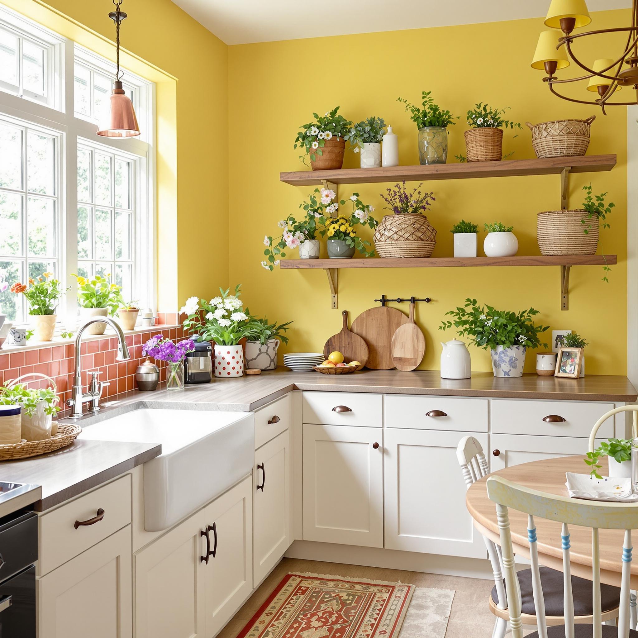
Now let’s switch to warm colors. Picture buttery yellows, soft oranges, and rich terracottas. These shades make a kitchen feel alive, like someone turned up the heat on a cold morning. Who wouldn’t want their kitchen to double as a mood booster?
Yellow has a magical way of making you happy. Studies show it boosts serotonin, the “feel-good” hormone. Years ago, I painted my kitchen pale yellow. Suddenly, breakfast prep felt less like a chore and more like fun. Weird how color does that, right?
Warm doesn’t always mean bright, though. Earthy beiges and muted oranges work well if you want subtlety. Think clay pots, sandy beaches, or fall leaves. These tones fit perfectly in rustic or farmhouse kitchens because they blend with wood and stone. Pro tip: pair them with copper accents for instant coziness.
But here’s the catch: balance is key. Too much warmth can overwhelm, especially if your kitchen lacks natural light. You don’t want to feel like you’re cooking inside a giant pumpkin spice latte. Trust me, I learned this the hard way after going overboard with orange tiles once.
Bold Choices: Making a Statement
Alright, let’s get bold. Navy blue, sage green, deep emerald, even moody charcoal. These colors aren’t for everyone, but when they work, they really shine. Imagine navy blue cabinets with brass hardware. Sounds dreamy, right? Bold colors command attention without trying too hard.
Navy blue is having a moment. It’s elegant, timeless, and versatile. Pair it with white countertops for a nautical vibe, or add walnut shelves for warmth. A buddy of mine redid his kitchen in navy, and it went from blah to breathtaking. He says it makes him calmer while cooking, which is saying something since he used to burn toast constantly.
Sage green strikes a nice balance between bold and soothing. It’s fresh yet grounded, perfect for modern farmhouse styles. I once visited a café with sage walls, and my chai latte felt fancier. For home kitchens, try sage on an accent wall or lower cabinets to keep things interesting.
Emerald green takes boldness up a notch. It’s lush, luxurious, and dramatic. Pair it with gold fixtures for glam vibes. But fair warning: this combo isn’t low-key. It’s more “I host dinner parties weekly” than “I microwave leftovers nightly.” Still, if it fits your personality, go for it.
Practical Benefits and Style Suitability
Choosing a kitchen color isn’t just about looks—it’s also about functionality. Whites and grays are great for resale value because they appeal to most people. Bold colors like navy or emerald make your kitchen stand out, but not everyone loves them. If you’re selling soon, stick to neutrals for main features and save boldness for removable items like curtains or art.
Lighting matters too. Natural light enhances warm hues, while artificial lighting can make or break certain shades. Under-cabinet lights paired with navy cabinets create a stunning contrast. Harsh fluorescents might wash out softer colors like sage. Personally, I love LED strip lights—they’re efficient, customizable, and give any kitchen a high-tech edge.
Smart appliances are trending, and their sleek designs pair well with minimalist palettes. Stainless steel looks great against whites and grays, while black stainless steel complements deeper tones like navy or charcoal. Have you noticed how many fridges now come with built-in screens? Wild times we live in.
Wrapping Up the Color Palette Conversation
Picking the right kitchen color is part science, part art, and part gut feeling. Whether you love neutrals for their versatility, warm hues for their cheer, or bold shades for their wow factor, there’s no wrong answer—as long as it feels right to you. Trust yourself. Your kitchen should reflect *your* style, not some Pinterest fantasy.
Take risks, mix textures, and experiment until it feels right. After all, a fresh start in the kitchen isn’t just about paint swatches. It’s about creating a space where life happens, memories are made, and maybe, just maybe, burnt toast becomes a thing of the past.
Practical Tips for Implementing Your Chosen Color Palette
Alright, let’s get into making your kitchen color palette work. You’ve picked your colors—nice job—but now it’s time to bring them to life. Don’t sweat getting everything perfect right away. Design is all about playing around and tweaking until it feels right.
Pairing Colors with Cabinetry and Countertops
Cabinetry and countertops are the backbone of your kitchen design—they hold it all together. When pairing them with your palette, think balance. Bold cabinets? Go neutral on countertops. I once saw yellow cabinets paired with black granite. It worked because they added brass hardware to tie it together.
- Warm palettes: Stick to earthy tones like walnut or butcher block.
- Cool palettes: Try sleek options like marble or stainless steel.
- Mix textures: Pair matte cabinets with glossy countertops for depth.
Here’s a tip: If you’re unsure about bold cabinetry, start small. Paint the inside of glass-fronted cabinets or just the island base. Low risk, big impact.
Using Accent Walls or Backsplashes Effectively
Accent walls and backsplashes can really make your kitchen pop. They’re not just decorative—they set the tone for the whole room. A well-placed accent wall adds coziness, while a standout backsplash injects personality without taking over.
I helped a friend redo her kitchen once. We chose teal subway tiles for the backsplash. Paired with white cabinets and gold fixtures, it was subtle but striking. She still gets compliments on it. The lesson? Use your favorite colors in unexpected ways.
For an accent wall, consider textured finishes. Brick veneers or shiplap panels add dimension. Just don’t overdo it—if your kitchen is already busy, keep the accent simple.
Balancing Natural and Artificial Lighting
Lighting can make or break your color scheme. Bright whites look crisp in sunlight but harsh under fluorescents. Rich jewel tones feel moody during the day but warm at night.
Layer your lighting. Use pendants above the island, under-cabinet LEDs for tasks, and maybe a chandelier if you have high ceilings. Don’t forget window treatments! Sheer curtains soften daylight, while blinds control glare.
Fun story: I painted my kitchen sage green once, only to find it looked grayish at night. Lesson learned—always check how colors look at different times of day before committing.
Maintaining Cohesion with Adjacent Living Spaces
Your kitchen doesn’t exist alone, especially if it’s open-plan. Keep it cohesive with nearby spaces, but don’t force everything to match. A little contrast can be refreshing.
If your living room has warm neutrals like beige and caramel, carry that warmth into the kitchen. Swap cabinet knobs to match metallic finishes in the living room. Or, if the adjacent space is minimalist, keep the kitchen clean-lined but add pops of color with accessories like rugs or bar stools.
Pro tip: Rugs are lifesavers in kitchens. They add comfort and tie in colors from nearby rooms. Plus, they’re easy to swap out later.
Final Takeaway
At the end of the day, designing your dream kitchen is about what makes *you* happy. Whether you love bold contrasts or soothing neutrals, trust your instincts and enjoy the process. Your home should tell your story. With these tips, you’re ready to bring your vision to life one step at a time.
FAQs
**Q1: How do I choose the right paint finish for my kitchen walls?**
A: For kitchens, satin or semi-gloss works best. They’re durable and easy to clean. Test samples first to see how they look in different lighting.
**Q2: Can I mix multiple colors in my kitchen without chaos?**
Yes! Stick to a theme, like shades of the same color family. Add balance with neutrals and limit bold hues to accents.
**Q3: What’s the best way to update my kitchen on a budget?**
Paint cabinets, swap hardware, or update lighting. These changes make a big impact without breaking the bank.
**Q4: Should I match my appliances to my color palette?**
It depends. Stainless steel is versatile. Colored appliances can add fun but should complement your design.
**Q5: How important is lighting when choosing a color scheme?**
Very important! Lighting changes how colors look throughout the day. Always test colors under both natural and artificial light.
**Q6: Is it okay to use wallpaper in a kitchen?**
Yes! Modern wallpapers are durable and washable. Avoid placing them behind stoves or sinks where moisture could damage them.
**Q7: How do I incorporate trends without going overboard?**
Use trendy elements sparingly—think throw pillows, art, or small appliances. This way, you can update easily as trends change.
**Q8: Can I combine wood tones with painted cabinets?**
Absolutely! Mixing wood tones adds warmth. Just ensure some connection, like matching hardware or shared undertones.
**Q9: How do I handle conflicting opinions with a partner on color choices?**
Compromise. Combine elements you both love, like blending favorite colors in accessories or opting for neutrals with accent pieces.
**Q10: Any advice for renters who want to personalize their kitchen?**
Renters can use removable solutions like peel-and-stick backsplash tiles, temporary wallpaper, or colorful textiles. Personalize without permanent changes.