
How Global Events Shape 2025 Living Room Color Trends
Global events often guide how we choose colors for our homes. Think about the past few years. Many people spent more time indoors. This led to a rise in warm, comforting tones. Neutrals like beige and soft gray became popular. They create calm spaces.
For 2025, expect bolder choices. People are ready to embrace life again. Brighter shades like terracotta and olive green will shine. These hues bring energy and connection to nature.
- Warm neutrals: Perfect for cozy vibes.
- Bold accents: Add personality to your space.
- Nature-inspired tones: Reflect a desire for balance.
These trends show how world changes impact design. Colors help us express emotions tied to our experiences.
Cultural Shifts Influencing Living Room Colors in 2025
Culture shapes what feels “right” in our homes. In recent years, many embraced minimalism. Clean lines and simple palettes ruled. Now, things are changing. People want rooms that tell a story.
Artisanal crafts and handmade items inspire new color palettes. Deep blues and rich browns mimic natural textures. These shades connect us to tradition. At the same time, they feel modern.
Travel also plays a role. As borders reopen, global influences grow stronger. Moroccan reds and Indian yellows make their way into living spaces. These colors spark joy and curiosity.
- Minimalism gives way to layered looks.
- Handmade details inspire deeper hues.
- Travel fuels interest in vibrant shades.
Choosing colors with cultural meaning makes spaces personal. It’s about more than style—it’s about storytelling.
Technological Advancements Driving Color Choices
Tech changes how we see color. Smart lighting lets you adjust tones throughout the day. Morning blues can shift to evening golds. This flexibility opens doors for creativity.
Digital tools also play a part. Apps let you test colors virtually. You can see how a bold wall might look before committing. This builds confidence to try something new.
New materials influence trends too. Think metallic finishes or glossy surfaces. They catch light differently, adding depth to any shade. Silver accents pair well with cool grays. Copper warms up earthy tones.
- Smart lighting: Changes moods with ease.
- Virtual tools: Help experiment safely.
- Metallics: Add shine and dimension.
Technology makes it easier to explore fresh ideas. It bridges classic choices with modern flair.
Why the Right Colors Matter in Your Living Room
Color impacts mood and function. A poorly chosen palette can feel off. The right mix turns a room into a retreat. Start by thinking about how you use the space.
For relaxing areas, stick to muted tones. Soft greens or dusty pinks work well. If you entertain often, go bold. Jewel tones like emerald or sapphire add drama.
Balance is key. Pair brights with neutrals to avoid overwhelm. For example, a navy sofa pops against white walls. Add wooden furniture to ground the look.
I once helped a friend redecorate her living room. She loved teal but feared it would be too much. We used it as an accent. Teal throw pillows brought life to her neutral setup. Her guests always complimented the space.
- Pick colors based on room purpose.
- Blend brights with calming neutrals.
- Use accents to test bold shades.
The right colors make your living room both beautiful and practical. They set the tone for everyday moments.

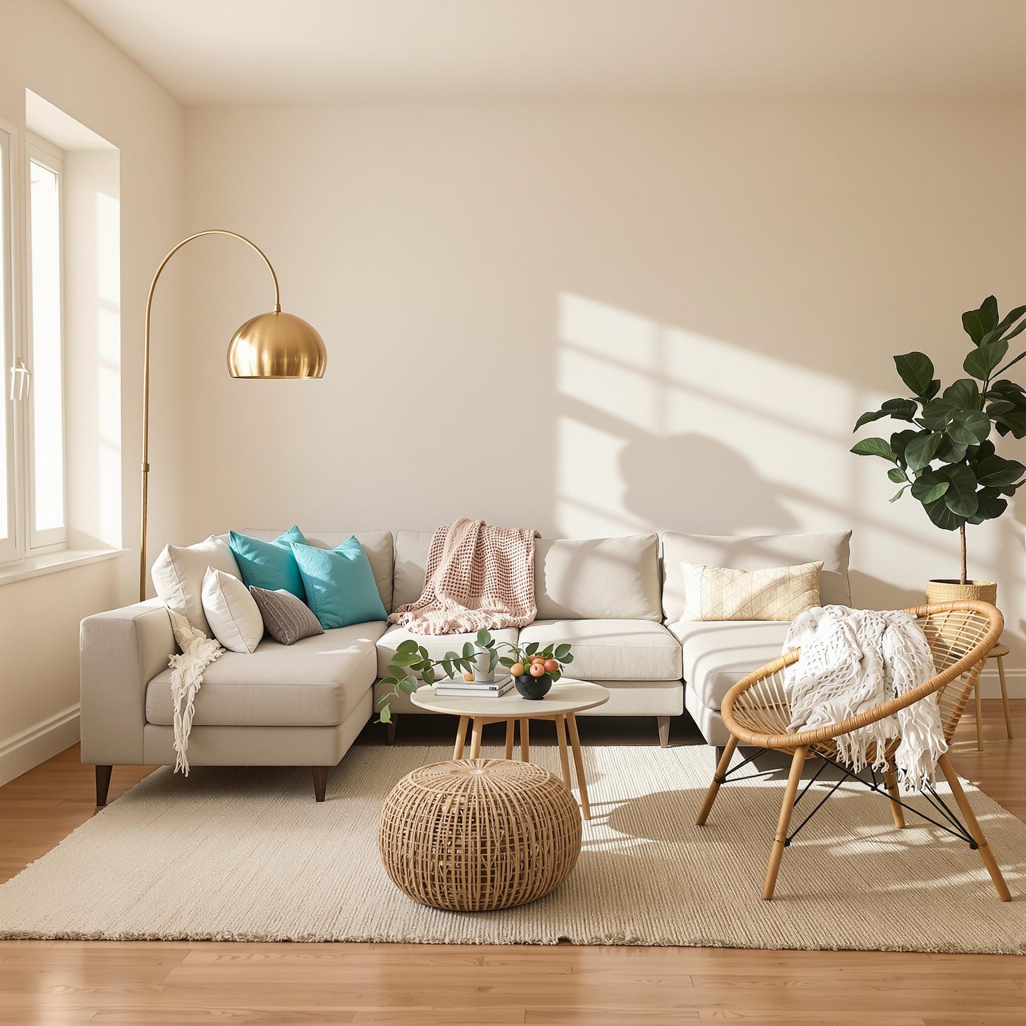
Warm Neutrals: The Unsung Heroes of 2025 Living Rooms
Warm neutrals don’t shout for attention, but they’re the steady friends you can count on. In 2025, these colors are stepping into the spotlight because they feel cozy and grounding. Think soft beige, creamy ivory, and muted taupe—like a warm blanket for your living room.
These shades aren’t just for minimalist spaces anymore. They work with bohemian or traditional styles too. For example, pair a taupe couch with layered earthy rugs. Add rattan furniture and colorful throw pillows, and you’ve got a relaxed yet polished look.
Lighting makes all the difference. Warm neutrals look best under soft light. Ditch harsh overhead fixtures for something cozier, like a floor lamp or string lights. I once had a beige sectional that felt blah until I added a vintage brass lamp—it changed everything. Little touches matter.
Bold Accents: Where Personality Meets Design
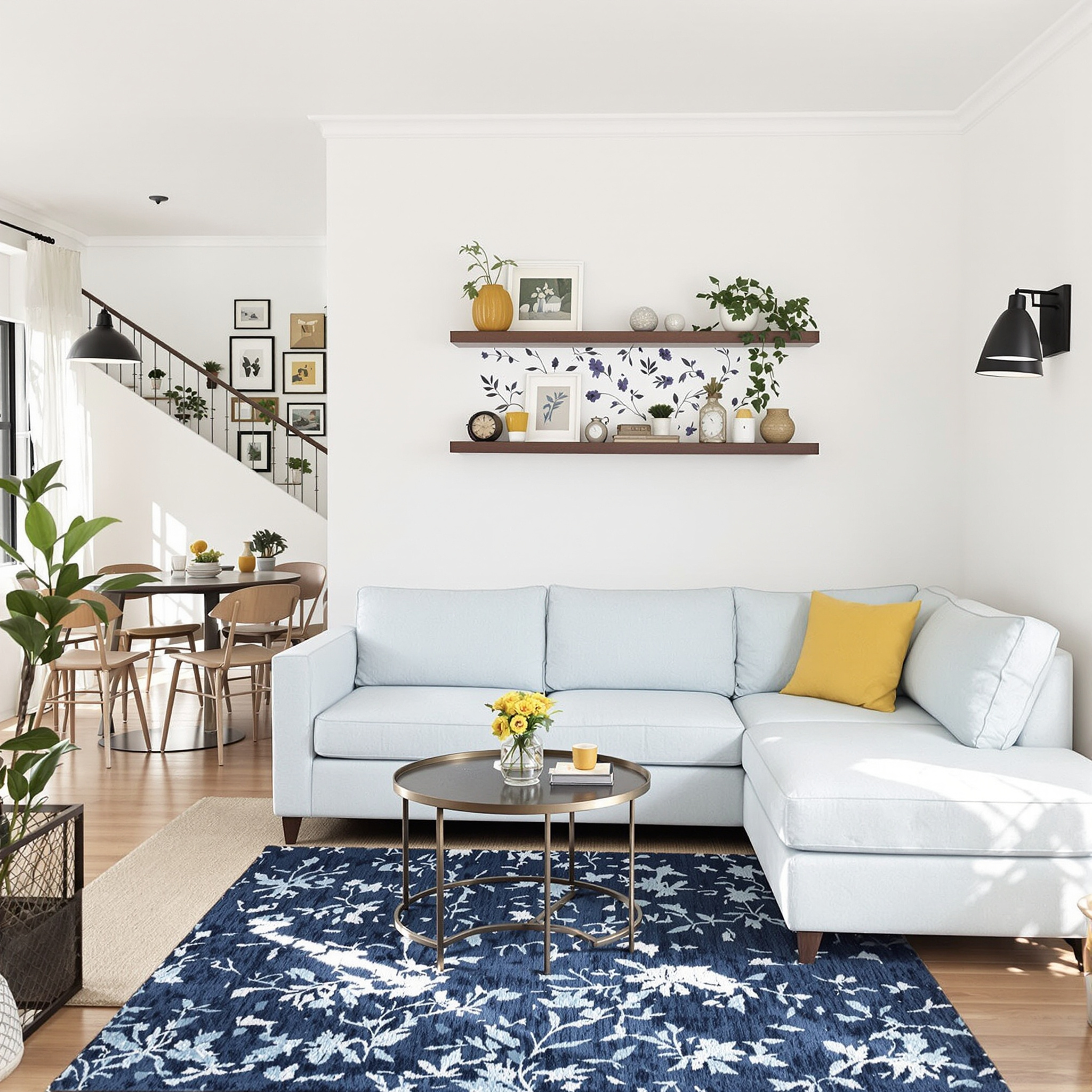
Bold accents bring the drama, and life’s better with a little flair. In 2025, jewel tones like emerald green, sapphire blue, and deep purple are everywhere. These colors demand attention, much like a diva on stage. But you don’t need to go overboard.
Use bolds in small doses—accent walls, artwork, or standout furniture. A navy-blue velvet chair against neutral walls? Perfect. Or try an emerald bookshelf filled with colorful books. Textiles like throws, curtains, and cushions are great ways to experiment without overwhelming the space.
A funny story: my cousin painted her whole living room bright red. She repainted after two weeks because it stressed her out. Lesson learned—balance is key. If one piece is bold, keep the rest calm. Your eyes will thank you.
Earthy Tones: Nature-Inspired Comfort
Earthy tones are huge right now, and I’m not complaining. Shades like terracotta, olive green, sandy brown, and ochre feel soothing and natural. They remind me of lazy hikes or sitting by a campfire. Good vibes only.
These colors work in any style. Modern spaces stay sleek but warm with wood and stone accents. Traditional rooms can use deeper shades like rust or forest green, paired with fancy details like crown molding or tufted chairs.
Texture is your secret weapon. Mix materials like jute, linen, or reclaimed wood. Try pairing a terracotta ottoman with a nubby oatmeal rug. It adds depth without being overwhelming.
Pro tip: plants are a must with earthy tones. A big fiddle-leaf fig or a cluster of succulents ties the room together. Plus, greenery makes your home feel alive.
Futuristic Metallics: Sleek and Shiny
Get ready for futuristic metallics—they’re taking living rooms to the next level. Chrome, brushed gold, and iridescent finishes catch the light in cool ways. This trend blends tech-inspired looks with chic design.
Start small if you’re unsure. Swap in metallic decor like lamps, vases, or picture frames. A copper coffee table or silver-framed mirror can elevate the whole vibe. I swapped my old lamp for a rose-gold one, and it made a huge difference.
Modern styles love metallics with clean lines and monochromatic schemes. Picture a white couch with chrome legs and gold side tables—sharp and stylish. Traditional spaces can use gilded frames or mercury glass vases for a touch of glamour.
Just don’t overdo it unless you want a disco ball effect (which could be fun). Use metallics as accents, not the main event. Less is more.
Tying It All Together: Furniture, Textures, and Lighting
You’ve picked your colors—now what? Balance them with furniture, textures, and lighting. These elements make or break your design.
Furniture should match your palette. A sleek black couch might overpower warm neutrals, but a camel-colored sectional blends perfectly. Bold walls need simpler furniture to avoid chaos. Let each piece shine.
Textures add magic. Layer fabrics like velvet, wool, and silk for depth. Don’t forget patterns—a geometric rug or floral pillow adds variety without straying from your theme.
Lighting sets the mood. Dimmer switches let you adjust brightness. Pendant lights, sconces, and candles create ambiance. I added fairy lights to my beige sectional—it turned into the coziest reading spot.
Wrapping Up the Palette Puzzle
At the end of the day, designing your living room is about what makes you happy. Whether you love warm neutrals, bold jewel tones, earthy shades, or futuristic metallics, there’s no wrong choice. Trust your gut, have fun, and experiment.
If you get stuck, Pinterest is just a click away.
Practical Tips for Adding Personality Without Overdoing It
You know how it is when you’re redoing a room. You want to try something bold, but then you worry you’ll regret it. I get it. Once, I painted a wall neon green because it was “in.” Big mistake. Hated it in a week. So take my advice—start slow.
If you’re unsure about big changes, go small. Throw pillows, rugs, and curtains are perfect for testing new colors. They let you experiment without committing. This year, terracotta tones are huge. Add some burnt orange blankets or copper vases. They’ll warm up your space fast. And if you don’t like them? No sweat. Swap them out.
Art is another great way to add personality. A cool print or canvas can make a big difference. I grabbed an abstract piece at a thrift store once—it had teal and mustard yellow that pulled my living room together. Cost me $15. Not bad, right?
Budget-Friendly Hacks for Small Spaces & Open Floor Plans
Small spaces and open floor plans can be tricky. But they also give you a chance to get creative. In tight spots, stick to light colors for walls and furniture. Soft creams, pale blues, or muted grays work well. They reflect light and make rooms feel bigger. Then, add pops of color with small items like lamps, books, or trays.
Open floor plans need more thought. You want each area to flow but still feel distinct. Rugs are a lifesaver here. Try pairing a neutral jute rug under the dining table with a plush navy one by the couch. It subtly separates spaces while keeping things cohesive.
Got kids or pets? Durability matters. That sleek white sectional might look nice online, but trust me—it won’t stay clean long. Go for stain-resistant fabrics or slipcovers in neutral tones. They’re practical and easy to update.
Avoiding Trend Fatigue: How to Keep Things Timeless
Trends change fast. One day it’s all over Instagram, the next it’s cringe-worthy. So how do you keep your space fresh without chasing every trend? Start with classic pieces. Think mid-century chairs, wooden coffee tables, or tailored sofas. These act as a solid base for adding trendy accents.
Go easy on the bling. Too much trendy stuff can overwhelm a room. Use wallpaper sparingly too. I love peel-and-stick options—they’re renter-friendly and low-commitment. Try a bold print behind shelves or inside a closet door. It’s unexpected and fun.
If you really want to go bold, paint just one wall or even the ceiling. A deep emerald green on the ceiling feels luxe but doesn’t take over the room. It’s a great way to make a statement without going crazy.
Final Thoughts: Your Living Room, Your Rules
Your living room should reflect you—not a magazine or Pinterest board. Trends are fun, but don’t let them boss you around. Mix in pieces that mean something to you, play with color, and enjoy the process. Your home should feel comfortable and happy.
Whether you repaint a wall or swap out pillows, make it work for you. Happy decorating!
FAQs About Updating Your Living Room with 2025 Color Trends
1. What are the top color trends for 2025?
Earthy tones like terracotta, olive green, and deep blues are big. Metallic accents like brass and copper add warmth.
2. Can I mix multiple trends in one room?
Yes, but keep it simple. Pair terracotta with olive green and add brass accents. Too many trends can feel messy.
3. How do I choose the right paint finish?
Use matte or eggshell for walls to hide flaws. Satin or semi-gloss works better for trim and high-traffic areas. Always test samples first.
4. What if I rent and can’t paint?
No problem. Try removable wallpaper, fabric panels, or large artwork. Colorful textiles can also brighten things up.
5. Is it worth investing in expensive accessories?
Not always. Thrift stores and budget retailers often have great finds. Focus on quality, not brand names.
6. How can I incorporate trends into a minimalist design?
Add one bold piece, like a colorful chair or lamp, against a neutral backdrop. Keep it simple.
7. Should I update my furniture to match new trends?
Not unless you need to. Refresh old pieces with slipcovers, new hardware, or paint. Accessories can bridge styles too.
8. How do I handle awkward-shaped rooms?
Use furniture to define zones. Vertical stripes or tall shelves help in narrow spaces. Mirrors bounce light into tricky corners.
9. What’s the easiest way to add texture?
Layer different materials like woven baskets, velvet pillows, and wool rugs. Plants add texture and life too.
10. How do I know if a trend will age well?
Look for versatility. Neutral tones and classic shapes tend to last. If something feels flashy or niche, use it sparingly so it’s easy to switch later.