
What is a Neutral Dining Room Color Palette?
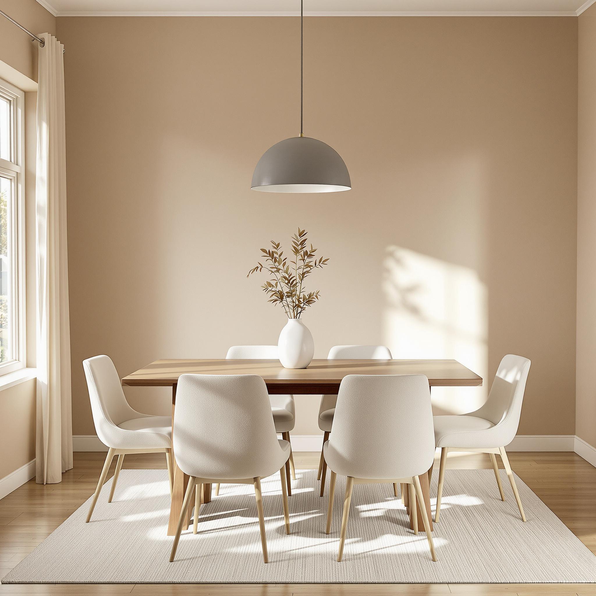
A neutral color palette includes shades that mimic nature. Think beige, gray, taupe, white, and cream. These colors act as a backdrop. They let other design elements shine. Neutrals don’t overpower a space. Instead, they create balance.
Neutral tones are calming. They make dining rooms feel inviting. These colors also adapt to trends. You can change decor without repainting walls. For example, adding colorful chairs or art works well with neutrals.
Popular neutral shades include warm beige and cool gray. Cream adds softness while taupe feels earthy. White keeps spaces bright. Each shade brings something unique to a room.
How Neutral Colors Affect Your Mood
Neutral tones have a psychological impact. They reduce stress and promote relaxation. In a dining room, this matters. Meals should feel peaceful, not chaotic.
Warm neutrals like beige create coziness. Cool neutrals like gray offer a modern vibe. Both choices encourage conversation. Guests feel at ease in these spaces.
I once painted my dining room a soft gray. It transformed the atmosphere. Family dinners became less rushed. The tone of our talks shifted too. Calm colors really do make a difference.
Versatility of Neutral Dining Rooms
Neutrals blend with any style. Modern, rustic, or traditional—neutrals work everywhere. They’re timeless. Trends may come and go, but neutrals stay relevant.
For instance, pair white walls with wooden furniture. Add black accents for contrast. Or try taupe walls with bold artwork. The options feel endless.
Seasonal updates are easy too. Swap tablecloths or centerpieces. Neutrals let you experiment without clashing colors.
Creating a Calming Atmosphere
Neutral shades evoke calmness. They mimic natural elements like sand and stone. This connection to nature soothes us. It’s why spas often use these tones.
In dining rooms, this effect is key. Meals become more enjoyable. The focus shifts from distractions to food and company.
For example, a beige dining room feels grounded. Gray walls add sophistication. Both shades bring harmony to shared spaces.
Tips for Choosing Neutrals Based on Light
Natural light affects how colors look. Assess your dining room’s lighting before choosing neutrals. Morning sun creates warmth. Afternoon light feels cooler.
Rooms with lots of windows suit lighter neutrals. White or cream brightens dark corners. Spaces with limited light need warmer tones. Beige or taupe prevents gloominess.
Test paint samples first. Watch how they change throughout the day. This step ensures you pick the right shade.
Considering Room Size When Selecting Neutrals
Room size impacts color choice. Small dining rooms benefit from light neutrals. White or pale gray makes tight spaces feel bigger.
Large rooms handle deeper neutrals well. Taupe or charcoal adds depth. These shades prevent big spaces from feeling empty.
If unsure, stick to mid-tone neutrals. Warm gray or soft beige works in most rooms. They strike a perfect balance.
Examples of Popular Neutral Shades
Here are some popular neutral shades for dining rooms:
- Beige: Warm and welcoming.
- Gray: Sleek and modern.
- Cream: Soft and elegant.
- Taupe: Earthy and versatile.
- White: Clean and classic.
Each shade offers unique benefits. Choose based on your goals for the space.
Why Neutrals Stand the Test of Time
Neutral palettes never go out of style. They’re adaptable and functional. Unlike bold colors, neutrals age gracefully.
They also save money long-term. Repainting isn’t necessary every few years. Neutrals grow with your tastes. Updating decor keeps them fresh.
Think of neutrals as a blank canvas. They let you express creativity without limits.
Layering Shades and Textures for Depth in Neutral Dining Rooms
Let’s talk layering—not the winter clothing kind, though that’s useful too. With neutral tones, layering adds life to a room without overdoing it. You’ve got beige, gray, cream, taupe—all great, but how do you keep things fresh? Mix textures and shades.
Imagine this: a soft linen tablecloth, rattan chairs, and a marble dining table. I tried something similar once, and it changed everything. Smooth surfaces like glass or polished wood paired with rougher materials like jute rugs or raw cotton throws made the space cozy yet classy.
Neutrals don’t have to be dull. They give you room to experiment because no bright color is hogging attention. Light ivory walls can look sharp against dark walnut furniture. Brushed nickel accents add just enough sparkle.
Here’s a tip if you’re unsure: pick one main neutral shade and build around it. Start with big stuff like walls or furniture. Then add smaller pieces like cushions, vases, or art with slight tone changes. This keeps things cohesive without feeling flat.
Monochromatic Magic: How to Pull Off an All-Neutral Look
Now let’s dive into monochromatic schemes. Sometimes simplicity works best. A neutral room feels calming, like every piece belongs. But it’s not as easy as painting everything beige. Trust me—I turned my living room into something that looked like a dentist’s office once.
The secret? Use different materials and patterns to break things up. Pair a dove-gray velvet chair with a chunky knit throw and a glossy ceramic lamp. These small touches add interest. And plants? They’re lifesavers. Stick to simple terracotta pots for greenery that fits right in.
Another idea? Mix metals. Gold candle holders, silver cutlery, and copper lights can all coexist beautifully. Just don’t go overboard—subtle metallic accents are key.
What I love about monochrome designs is their flexibility. Hosting a fancy dinner or having a lazy breakfast? Neutrals set the perfect stage. Plus, swapping seasonal decor is a breeze. Replace autumn pumpkins with winter greens, and boom—you’ve got a new vibe.
Accent Walls: When Neutrals Need a Little Drama
Maybe you love neutrals but want some drama. Accent walls are your answer. They don’t need bold colors or crazy patterns—even neutrals can make a statement. Picture a charcoal gray wall behind your dining table, paired with white trim and creamy chairs. Instant impact.
But accent walls come in many forms. Textured finishes are trendy for good reason. Try shiplap paneling in oatmeal or 3D tiles in sandstone. Both add depth while staying neutral.
Here’s a funny story: I convinced a friend to try grasscloth wallpaper on her accent wall. She was hesitant, worried it’d feel fussy. A month later, she couldn’t stop talking about how warm and chic it felt. Grasscloth softens edges while still looking sharp.
If wallpaper’s not your thing, try painting techniques like color washing or limewashing. They create a natural, uneven finish. Pair with rustic beams or exposed brick for a timeless farmhouse look.
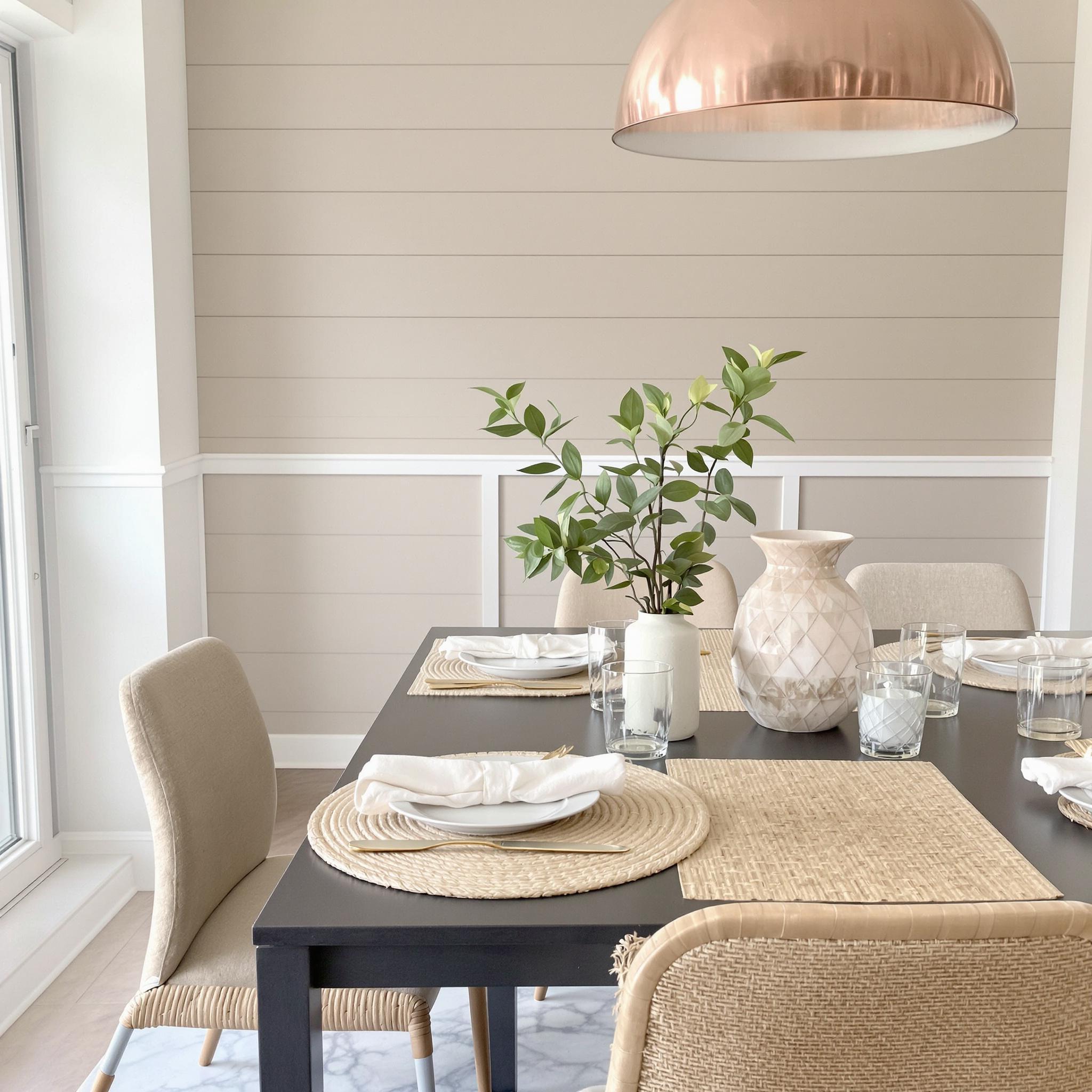
Paring Neutrals with Metallics and Wood Finishes
Let’s chat about pairing neutrals with metallics and wood. It’s a match made in heaven. Think oak tables, taupe chairs, and brass sconces casting golden light. Sounds inviting, right?
Metallics bring glamour to neutral spaces. A chandelier in antique bronze or polished chrome can elevate the whole room. Don’t forget small details like drawer pulls or napkin rings—they tie everything together.
Wood adds warmth and authenticity. From honey maple to rich mahogany, it brings richness. I’m partial to mid-century modern pieces with teak legs. They mix retro charm with modern style perfectly.
A fun idea? Mix wood tones. Blonde oak floors with a walnut buffet and bamboo placemats work well. As long as the palette stays neutral, variety feels intentional, not messy.
Avoiding Blandness While Maintaining Elegance
Now, let’s tackle blandness—the biggest fear with neutrals. The truth? Neutrals aren’t boring; it’s how we use them that counts. Here’s how to avoid the snooze zone while staying classy.
First, embrace asymmetry. Symmetry is nice, but throwing in something unexpected—like mismatched chairs or an odd-numbered vase cluster—adds intrigue. I swapped two matching chairs for a bench and armchair. Guests always noticed how unique it felt.
Next, play with scale. Big art or dramatic lighting grabs attention without clashing. A large abstract painting in grays can anchor the room while keeping it calm.
Lastly, personalize your space. Heirlooms, souvenirs, or handmade items tell your story. My grandma’s vintage tea set sits on my sideboard, reminding me of family meals. Those personal touches matter.
Avoiding blandness comes down to being thoughtful. Keep experimenting until it feels right. Your home should reflect *you*, not a Pinterest board.
Tips for Keeping Neutral Dining Rooms Fresh and Inviting
Neutral dining rooms are like your favorite jeans—timeless and easy to style. But even the classics need some care to stay fresh. Don’t worry, it’s not as hard as it sounds. A few simple tricks can keep your space cozy and sharp.
Start with cleaning. Dust dulls neutral tones over time. Vacuum upholstered chairs often using a soft brush attachment. For wood furniture, skip harsh chemicals. Use mild soap and water or a wood cleaner. Pro tip: microfiber cloths are lifesavers for walls and trim. I learned this after smudging my baseboards once.
Spills happen. Red wine on a beige rug? Spaghetti sauce on a cream chair? No stress. Blot stains quickly with a damp cloth. Use a gentle stain remover made for the material. If all else fails, toss on a throw pillow or decorative tray. Problem solved.
Refreshing Your Space Without a Full Makeover
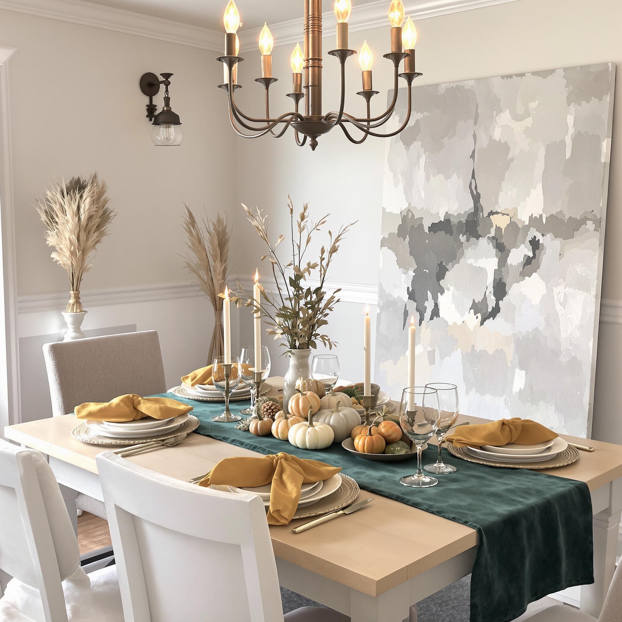
A neutral dining room doesn’t have to be boring. Think of it as a blank canvas. Seasonal updates are an easy way to refresh. In fall, swap light napkins for rich velvet ones in deep colors. Add dried eucalyptus or mini pumpkins for a cozy touch. In spring, go for pastel candles and fresh flowers. Small changes make a big impact.
Art is another way to add personality. Empty walls? Rotate art pieces throughout the year. Hang a bold black-and-white photo in winter, then switch to something bright in summer. I love leaning artwork instead of hanging it. It feels relaxed, like your space has stories to tell.
Lighting matters too. Changing a pendant light or chandelier can transform the room. Use warm bulbs in winter and cooler ones in summer. Dimmer switches create moodier vibes. String lights? Always a good idea. Lighting isn’t just functional—it sets the tone for meals, casual or fancy.
Blending Neutrals with Trendy Colors and Patterns
Neutrals are classic, but adding trendy colors or patterns keeps things modern. Neutrals balance bolder choices so nothing feels overwhelming. Where to start?
Patterns are a safe bet. A striped rug under the table adds movement. Mix patterned plates with solid linens for contrast. My favorite combo? Neutrals with terracotta accents. Rust hues feel earthy and pair well with beige, gray, or white.
Accent colors are fun too. Emerald green, mustard yellow, and navy blue are trending. Add these through accessories—a vase, books, or a table runner. My mom gave me cobalt glassware once, and it changed family dinners. Suddenly, everyone wanted to stay longer.
Wallpaper can work wonders. A statement wall with a subtle print or textured grasscloth elevates the room. Keep the rest of the decor simple. It’s like accessorizing—you want one standout piece, not five fighting for attention.
Final Thoughts
A neutral dining room is all about balance. It’s practical yet stylish, simple yet full of potential. Care for your surfaces, refresh seasonally, and experiment with trends. Let the space grow with you. Design is personal. Whether you’re going for farmhouse or mid-century modern, trust your gut and enjoy the process.
FAQs About Maintaining and Updating Neutral Dining Rooms
-
How often should I clean my neutral furniture?
Dust weekly. Deep-clean every few months. Clean spills right away to avoid stains. -
What’s the easiest way to refresh a neutral dining room?
Swap small items like tablecloths, centerpieces, or cushions seasonally. Little changes go a long way. -
Can I mix different neutral shades together?
Yes! Layer ivory, taupe, and charcoal for depth. Stick to warm or cool undertones for harmony. -
How do I protect my neutral walls from scuffs?
Use washable paint finishes like satin or semi-gloss. Add chair rails or wainscoting in high-traffic areas. -
Is it okay to add color to a neutral room?
Absolutely! Accent colors enhance neutrals. Start small with accessories before committing to bigger pieces. -
What type of lighting works best in a neutral dining room?
Adjustable lighting is key. Use dimmers and mix overhead lights with lamps or sconces for layers. -
Should I worry about patterns clashing in a neutral space?
Not really. Stick to similar scales and color families. Limit bold patterns to one or two items per room. -
How can I incorporate textures into a neutral dining area?
Add woven baskets, rattan chairs, or chunky knit throws. Textures bring warmth and interest to simple spaces. -
Are there any “rules” for using wallpaper in a neutral room?
Keep it balanced. Choose one feature wall. Keep the rest of the decor minimal to avoid visual clutter. -
How do I blend neutrals with metallic accents?
Metallics pair beautifully with neutrals. Use brass, gold, or copper in lighting, frames, or hardware for a touch of shine.